This Week’s Font
Lea challenged me
to draw an alphabet every week of 2010. And so I did! Some turned out better than others. Some are more original, and some are exercises in imitating existing typefaces. The
title of this page is a reference to John Baez's "This Week's
Finds". Links go to TTF files.
|
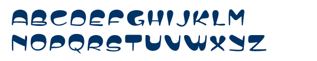
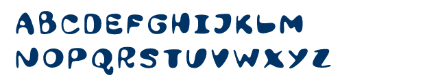
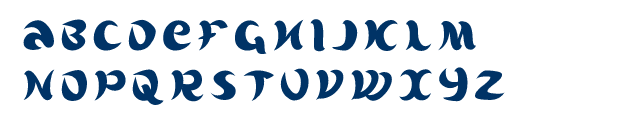
2010/12/31 PilutRather blobby. |

|
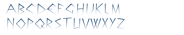
2010/12/24 PinesExtremely pointy. |
|
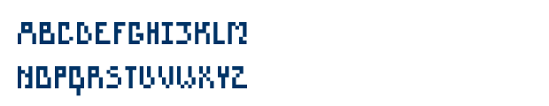
2010/12/17 SkatoloNonmonospaced pixel font. |
|
2010/12/10 WibPotraced result of some fiddling in the Gimp. |
|
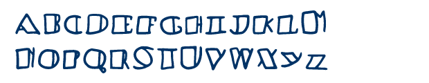
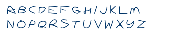
2010/12/03 BabetteStill another hand-drawn, because I have too been busy/lazy to make anything any more refined. |
|
2010/11/26 BlackboredAnother ridiculous blackboard-bold hand-drawn on the Wacom. |

|
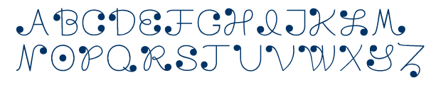
2010/11/19 OlvidarMade of dots. |
|
2010/11/12 DecaturAt the very end of 2004, I tried to study Chicago a bit, but it came out badly. I think this one went better. It's not really a direct imitation of Chicago the existing vector font, but an attempt to capture how I feel about Chicago the bitmap font. Feelings, man. Feelings. |

|
2010/11/05 PantsSort of exploring the same cheerful casualness as with Cruikshank, but without a specific model, and with fewer wibbly concave bits. |
|
2010/10/29 CrimpA straight-line lowercase, which nonetheless suggests a curve here and there. |
|
2010/10/22 BlorbA goofy hand-drawn. |
|
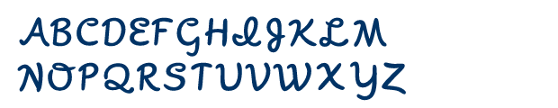
2010/10/15 LaminarA fun little swoopy, didone lowercase. |
|
2010/10/08 Handy (caps)Uppercase handwritten letters. |

|
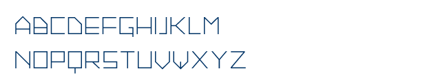
2010/10/01 SpectrumAnother experiment in a square-fit sort of feel, in a very light weight. |
|
2010/09/24 HandyA scan of my normal handwritten lowercase. Yes, I have in fact trained myself to write two-storey gs every time. |

|
2010/09/17 DentorRounded outsides, pointy insides. |
|
2010/09/10 LloydTall and sort of Art-Deco-y, at least according to my impression of Art Deco. |
|
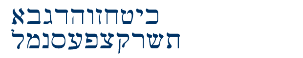
2010/09/02 GevaltAn inky Hebrew alphabet. |
|
2010/08/27 ScripNot legal tender! If you go to the wikipedia page on 'scrip' you get a face full of Papyrus, ew. |

|
2010/08/20 GalenaChunky and leaning a bit to the italic. |
|
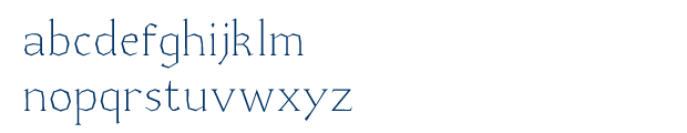
2010/08/13 GaussA somewhat rigid sans-serif lowercase. |
|
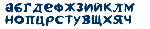
2010/08/06 MinskSome blobby Cyrillic. |

|
2010/07/30 BaklavaA chunky Greek alphabet. |

|
2010/07/23 FacefontAn 'alphabet' of faces. A bit of a cheat, but certainly not a shortcut. The ones I did first are very rough, but I think I improved gradually. |

|
2010/07/16 RestoBased on some signange for a defunct restaurant near 12th and Market. |
|
2010/07/09 Witt (caps)Filled up Witt with caps and numbers and punctuation. |

|
2010/07/02 TonicSomewhat squat, with octagon-y serifs. |

|
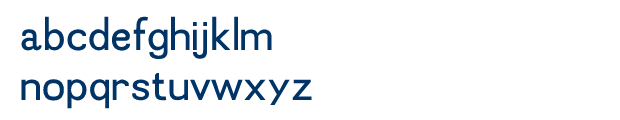
2010/06/25 PutterA quick sans-serif lowercase, with mostly constant weight. |

|
2010/06/18 DerailleurAn experiment in reverse contrast. |
|
2010/06/11 WittAn unassuming slab serif. |

|
2010/06/04 PatiencePretty much an anti-blackletter sensibility except perhaps in its weight. |

|
2010/05/30 Frack (caps)Psyfe dared me to do caps for Frack, so I did them over the weekend. |

|
2010/05/28 FrackMy first time revisiting blackletter since slavkäppen. I really like how the g, y, v, w turned out. Here is the reference I used. |
|
2010/05/21 TogTiny or absent counters in a salad of greek-ish letters and pac-mans. |

|
2010/05/14 ColonyA soft, friendly uppercase, in contrast to the week before. |
|
2010/05/07 CodexA slightly-less-stabby but still very much straight-liney lowercase script thing. |

|
2010/04/30 AdmissibleA cramped, angular lowercase (!). |
|
2010/04/23 DropletLetters built from ill-balanced swooshes. |
|
2010/04/16 BobbinWarning: contains ridiculous ball terminals. |

|
2010/04/09 SwabA silly ultra-high-contrast sans. |
|
2010/04/02 QuizThe obvious constraint is using only 45 and 90 degree angles. |
|
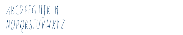
2010/03/26 DitterI made this one a long time ago, back when lea and I were first working on ditter-the-telegraph-key/twitter-interface, but it didn't really turn out to be the right style for that. Still, it's an alphabet, and I noticed I never put it up before. |
|
2010/03/26 MarkovA very quick handwriting font, due to impending ICFP deadline. |
|
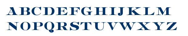
2010/03/19 SilverforkA tribute to the ubiquitous Copperplate Gothic. I didn't look at the original too much after making sure my C was appropriately horseshoe-shaped, and that my G was spiny in enough places. I'm happy to find that what I thought was an absurdly over-seriffed N in mine is actually comparable to the original. The real Q is kind of weird to my eye. I'm on the fence as to whether I like my two-overlapping-V version of the W better or not. |

|
2010/03/12 DoppioNot very consistent, but sort of fun anyway. |

|
2010/03/05 GravelA chunky straight-liner, no skimping on serifs. |

|
2010/02/26 CobblerA cheery |
|
2010/02/19 TaseOptimized for pointiness and top-heaviness. |
|
2010/02/12 BigfootA wide high-contrast face, with lovingly bracketed serifs. It could use some tweaking, but I am pretty happy with it. I have actually been working on it since the middle of January and cranking out lesser material while slowly producing it in the background. |

|
2010/02/05 ShippingA pixel font. |

|
2010/01/29 CruikshankStudying the lettering from the animation work of Sally Cruikshank. Specifically, the opening credits to "Make Me Psychic". |

|
2010/01/22 QuotientEverybody's gotta try making a modular font a few times before realizing it's a terrible idea, right? |

|
2010/01/15 AdiposeIn a sculptural frame of mind — just chipping away from a black square. |
|
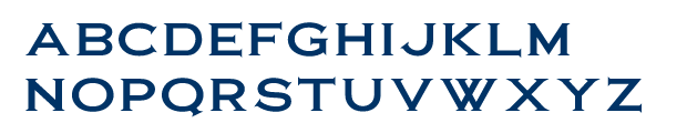
2010/01/08 CarnitasThose of you who know me (or who know early-20th-century geometric sans serifs) well will recognize what this is an obvious imitation of. As an exercise I did it from memory without looking up the actual font for reference, and I daresay I got reasonably close. Which is to say, I go to Chipotle way too often, but I already knew that. The elimination of the angled terminals on C, S, G was intentional though, for I really don't care for them. Apart from that I notice my M's middle sinks lower, the curves in my B, D, P, R are a bit squarer in general and in the P and R they are actually square and not curved on the insides. |

|
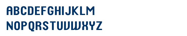
2010/01/01 KimballA quick little monocase font named after the CTA Brown Line terminus. It is intended to be what it would look like if Gotham and Clarendon had a baby. |