Printmaking
The Pittsburgh Artists Image Resource is an awesome place. On Tuesday nights from 1900-2300, anyone can pay $5 to use their inks and screens and studio space. I've taken advantage of this a number of times to make screenprints. I think it's really fun. So far I've mostly been doing sort of a series of buildings on and around CMU campus, but I'm starting to mix it up with other things.My drawings are done in FontForge, my favorite vector editor, and then I use Illustrator or Inkscape to test colors and make separations. The lettering is sometimes done from scratch just for one print, and sometimes it is a font that I had already made beforehand. There are also a few photos here of prints friends of mine have done at AIR. Printmaking is fun for kids of all ages!
Date: 2005/10/18
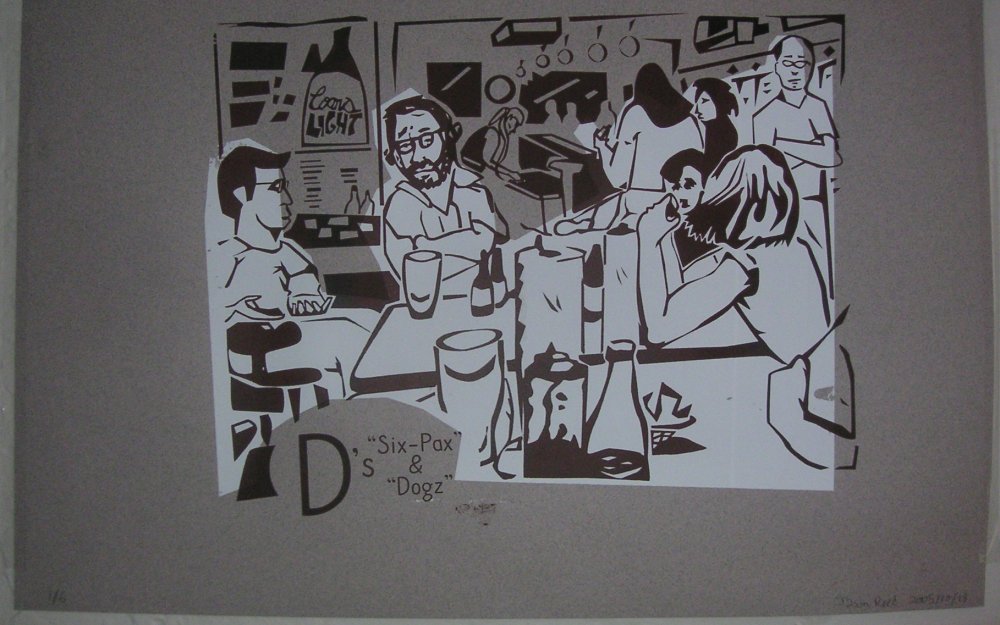
Title: "D's Six-Pax and Dogz"
Larger Image: dogzprint.jpg
About:
A depiction of my favorite hog-dog-and-type-theory party time hangout.
This started as a drawing I did from a photograph, and then I scanned the drawing
and traced it in Fontforge. This one is larger than all the previous ones; I made two
8 1/2 x 11 transparencies and taped them side-by-side with some overlap.
I'm pretty happy with it, although most of the 6 prints I did
were incredibly underinked on the white, because I didn't anticipate the sheer volume of
ink I needed for such a large area.
Font used: Nelf.
Date: 2005/10/11
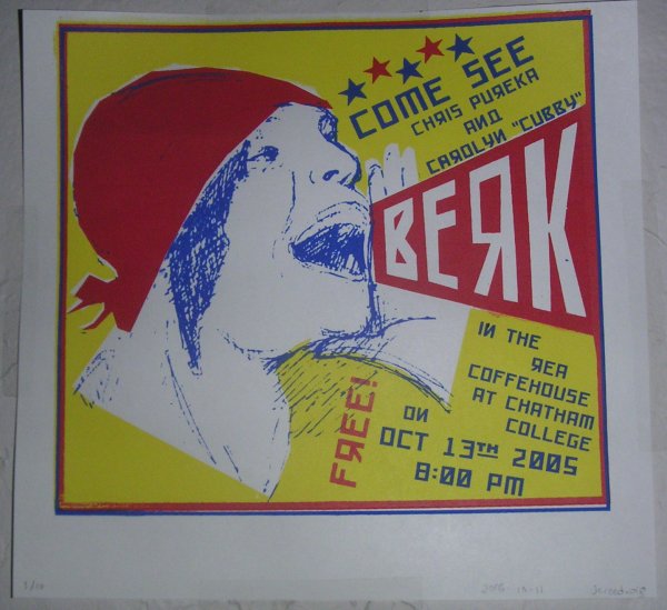
Title: "Carolyn Berk Concert"
Larger Image: berkprint.jpg
About:
Ugh ugh ugh. This is a vigilante poster advertising a concert I went to a couple
days after the poster was made. I took my sketchbook drawing of the (apparently famous)
Rodchenko poster showing Lily Brik shouting into a trapezoid, scanned it in,
and colored it. I like the colors, but the gross sketchy quality of the pen lines
clashes horribly with the crisp shapes everywhere else.
Also, I had just seen this particular image in a book of Russian Constructivist posters, and
I used it because it just happened to be
one of my favorites, but it turns out that Franz Ferdinand recently made an album cover
that looks the same --- by which I mean obviously inspired by the exact same poster --- only good. (since they, like, recreated the motif
of the poster with a modern photo of their own model, etc.) I had this pointed out
to me by another guy printing at the place Tuesday night. So basically anyone who
knows anything about indie music (read: not me) will probably think this looks
even worse, contextually, than it already does. I guess they can't be all winners.
At least the cheesy faux-russian type came out okay.
Date: 2005/10/4
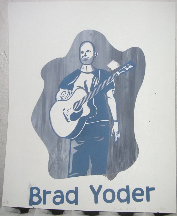
Title: "Brad Yoder"
Larger Image: yoderprint.jpg
About:
I thought I'd try depicting something other than
just inanimate objects this time. Lesson learned: faces and hands almost
always look like crap unless you are very careful, and maybe even then.
However, I didn't have any underinking problems this time, and I like how the Swirly-
McWhirly-world stuff came out. I need to make sure I let the screens dry thoroghly
in the future so things don't get messed up like the "B" did, and also not
to tape over defects in the screen in the middle of areas that are
supposed to print (notice the mysterious blank patch just above the guitar)
Font used: Larson (still not finished)
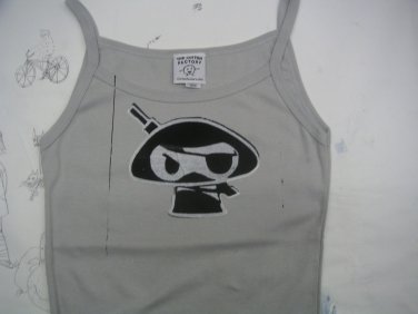
Date: 2005/10/4
Guest Artist: Annette
Title: "Chris the Ninja Pirate"
About:
Annete put Chris the Ninja Pirate (from the Weebl and Bob cartoons I think)
on a tank-top!
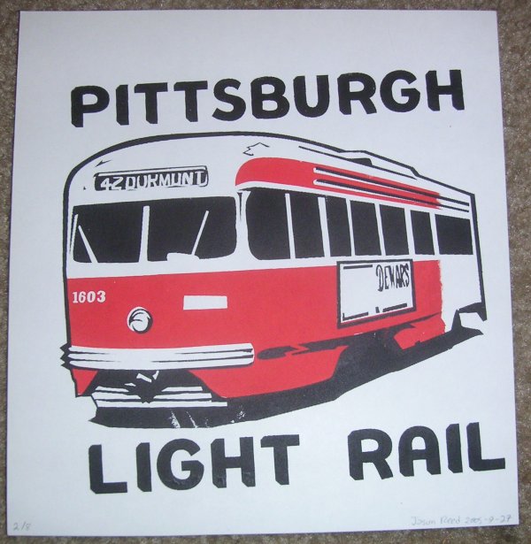
Date: 2005/9/27
Title: "Pittsburgh Light Rail"
Larger Image: lightrailprint.jpg
About:
An old streetcar in pittsburgh; the photo
I based this on was from '72. Aside from the major inking error (the missing red on the right)
I'm very happy with this print. Looking back, I never used straight-up black before! I like
the crispness of it against the red.
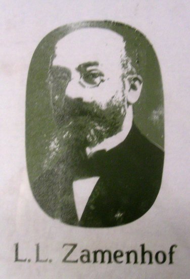
Date: 2005/9/27
Guest Artist: Adam
Title: "L. L. Zamenhof" [?]
About:
An enigmatic portrait of L. L. Zamenhof, creator of la lingvo internacia, Esperanto.
Font used: Fallacy.
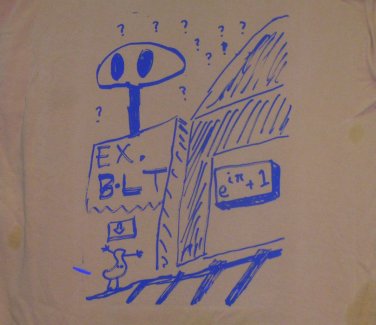
Date: 2005/9/20
Guest Artist: Adam
Title: "Explosive Bolts" [?]
About:
Adam made this as a T-shirt. He just up and drew the whole thing with a sharpie. It's awesome.
Banana-wug!
Date: 2005/9/20
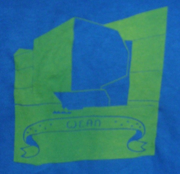
Title: "Wean"
Larger Image: weanshirtprint.jpg
About: Wean again. The yellow ink is not showing up well on the blue shirt; in general
light inks on dark shirts seem to be not so great if they are even slightly under-inked.
Date: 2005/9/20
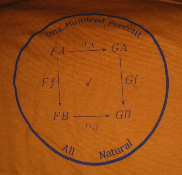
Title: "All Natural"
Larger Image: allnaturalprint.jpg
About:
A silly math pun. The diagram depicted is the defining diagram of a "natural transformation",
a fundamental concept in category theory. The fine strokes on the alphas and the scriptstyle majuscules
dropped out during the exposure, but whatever. The actual inking step, however, was essentially flawless,
even though the squeegee I was using was dangerously small for the width of the image.
Font used: Kenosha.
Date: 2005/9/20
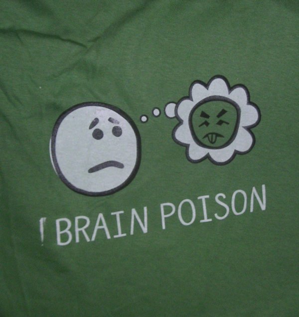
Title: "Brain Poison"
Larger Image: brainpoisonprint.jpg
About:
I like how this one turned out, except for one trapping and one masking mistake, both on the left.
The shirt refers to my opinion of a certain academic paper I read recently.
Font used: Nelf.
Date: 2005/9/20
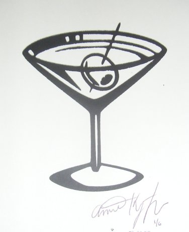
Guest Artist: Annette
Title: "Martini Glass" [?]
About:
Annette's first try screen-printing. I think it came out great!
Date: 2005/9/13
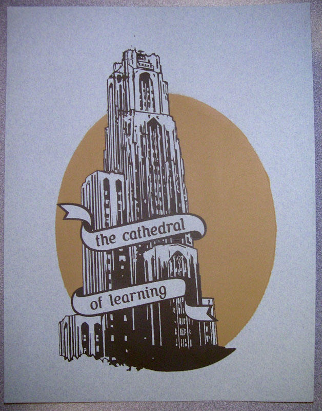
Title: "The Cathedral of Learning"
Source: cath.svg
Larger Image: cathprint.jpg
About: The major landmark on the University of Pittsburgh campus.
Date: 2005/9/6
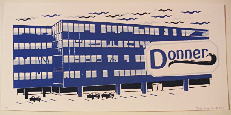
Title: "Donner"
Source: donner.svg
Larger Image: donnerprint.jpg
About: A dormitory (mostly filled by freshmen, since the upperclassmen
almost always prefer to live somewhere else) at CMU. Delightfully
ugly, it is made with blue panelling that looks like it passed its expiration
date some time in the late 50s.
Date: 2005/8/30
Title: "Hamerschlag"
Source: ham.svg
Larger Image: hamprint.jpg
About: The engineering building. Actually kind of pretty architecturally. Its
name is tragically mispelled with two "M"s.

Date: 2005/8/23
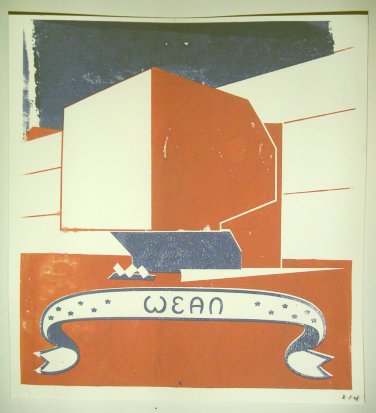
Title: "Wean"
Source: wean.svg
About: Wean houses the CS department, among others. It won an
award for best use of concrete or something.